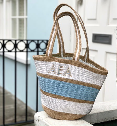
Font styles are our thing... we work with hundreds of them in our studio and we've curated a collection of our favourite 50 or so fonts for our website's monogram design app.
Font style preferences tend to come in waves... one great photo on Instagram inspires a number of orders using the same font style and thread colour choice. But they also change based on the overall zeitgeist of the world, we've found.
Looking back on 2021, a year of working mainly on our computers rather than in person, a year of weddings and parties postponed, many new babies born, euphoria and despair, it's very interesting (for those of us who are font-obsessed) to see which were the most popular in this year like no other.
So here they are: the most popular monogram font styles of 2021. We've divided the list in to Letter fonts (for text) and Shape fonts (for traditional monogram designs):
Letter Fonts
Copperplate
This typeface, introduced in 1901, is characterised by the tapered flicks on the ends of each letter. It is influenced by lettering on vintage copperplate engravings (hence the name!). Copperplate is a capital letter only font, since the design was intended to be used for headings and key words rather than for body text. Maybe that's why it makes a great monogram. It's a no-nonsense, gender-neutral font that embroiders beautifully and was our most popular font in 2021 (and many preceding years).
Cheltenham Tall
Cheltenham is a typeface for display use designed in 1896 and shows influences of the
Arts and Crafts Movement. Originally intended as a text face, "Chelt" became hugely successful as a headline font too... it's not often that a font is used for both purposes. We love its tall but thick letters which allows for beautiful embroidery detail in narrow spaces.
Sweetheart
Sweetheart is a pretty script font that revives handwriting from the mid 20th century. It is characterised by a bouncy, feminine sweetness and is a great option for monogramming a girl's name or text. It's less popular for initials.

Bodoni
Bodoni is a typeface that was first created by
Giambattista Bodoni in the late eighteenth century. The font is characterised by a contrast between thick and thin strokes within each letter.
Some digital versions of Bodoni are said to be hard to read due to "dazzle" caused by the alternating thick and thin strokes, particularly at small point sizes which is why in writing it is most often used as a heading font.
In monograms, we recommend that it be scaled at least 3cm in height so the stitching on the thin sections of each letter sews well.
Massimo Vignelli an Italian designer responsible for, amongst other major achievements, the New York subway signage, stated that "Bodoni is one of the most elegant typefaces ever designed". We agree.

\
Athletic
This font began its life as a student project to design a T-shirt at an American university. It has now grown up into a widely used global typeface.. Athletic has the look and feel of hoodies and t-shirts that are ubiquitous on the campuses of colleges and universities over the world. We love how it embroiders due to the width of the letters, allowing for lots of stitch texture. It works well for both names and initials.
Handy Script
Handy Script Is a retro style script font that is casual and relaxed. It looks a bit like school-taught handwriting and it's a great font for names or other text rather than initials.
Shadow Font
Shadow Gothic influences our own Shadow monogram font. The typeface is typically used for headlines to create a powerful and three-dimensional effect. We absolutely love it for initials because it's a wide font that allows for great stitch detail, as well as two colours that complement or contrast each other.
Futura Border
Our two-colour Futura Border font, with a bold outline in a second colour, belongs to the Futura font family. Futura is a sans-serif font released in 1927 in Germany. It is based on geometric shapes, especially the circle, similar in spirit to the
Bauhaus design style of the period.
Futura has an appearance of modernity and efficiency. It's perfect for both names and initials and we love the opportunity to use two thread colours: one for the inside of the letter and another for the border.
Schoolbook
Because it is so easily readable, this typeface was originally designed expressly for schoolbooks and children's books. However it is now widely used as a general purpose font and it is hugely popular as a monogram font. It is neither elegant or casual, masculine or feminine... it is a perfect all-purpose monogram for both names and initials.
Monogram Shapes
Monogram shapes take a typeface and elevate it with decorative touches. This practice started as a feature of hand-embroidery centuries ago and reached its heyday in the Victorian era, when decorative monograms were added to almost everything.
With the Industrial Revolution and the growth of the modern corporation at the turn of the 20th century, monogram shape styles evolved from a practical form of identification to a modern brand design tool, particularly for companies. So many modern monogram fonts have their roots in a corporate logo. Some of the most popular monogram shape fonts of 2021 originated this way including:
Circle Font
This is our most popular monogram shape font. It was inspired by the Art Deco Great Western Railway logo introduced in 1934 and has been adapted for embroidery on a huge scale. It takes a san-serif block font and shapes each letter into three versions: a left initial, a centre initial and a right initial. When put together they make the shape of a circle.
Large Centre Initial
Interestingly, Great Western Railway updated its circle logo to this form at the end of the 21st century. And now it too is a hugely popular monogram font. It uses Bodoni typeface and arranges the initials in a way that emphasises the most important initial but making it larger and putting it in the centre of the design.
Ivy
Our Ivy monogram shape font is an example of the use of heavy decorative flourishes to a traditional script font. This is a Victorian tradition and, in one stunning example, can be seen on the gates of Kensington Gardens where there is a gorgeous monogram for Queen Victoria in an Ivy-like font. We introduced Ivy to our website's monogram design app in late 2021 and it quickly became one of our most popular fonts.


 \
\


